Make the first screen count.
Bring the product, the voice and the next action into one clear opening.
DOUGH BAKERY / WEBSITE REDESIGN
Independent concept · 2026Bringing the warmth of a Wellington bakery into a digital experience with appetite, character and a clearer way in.
Explore the live redesign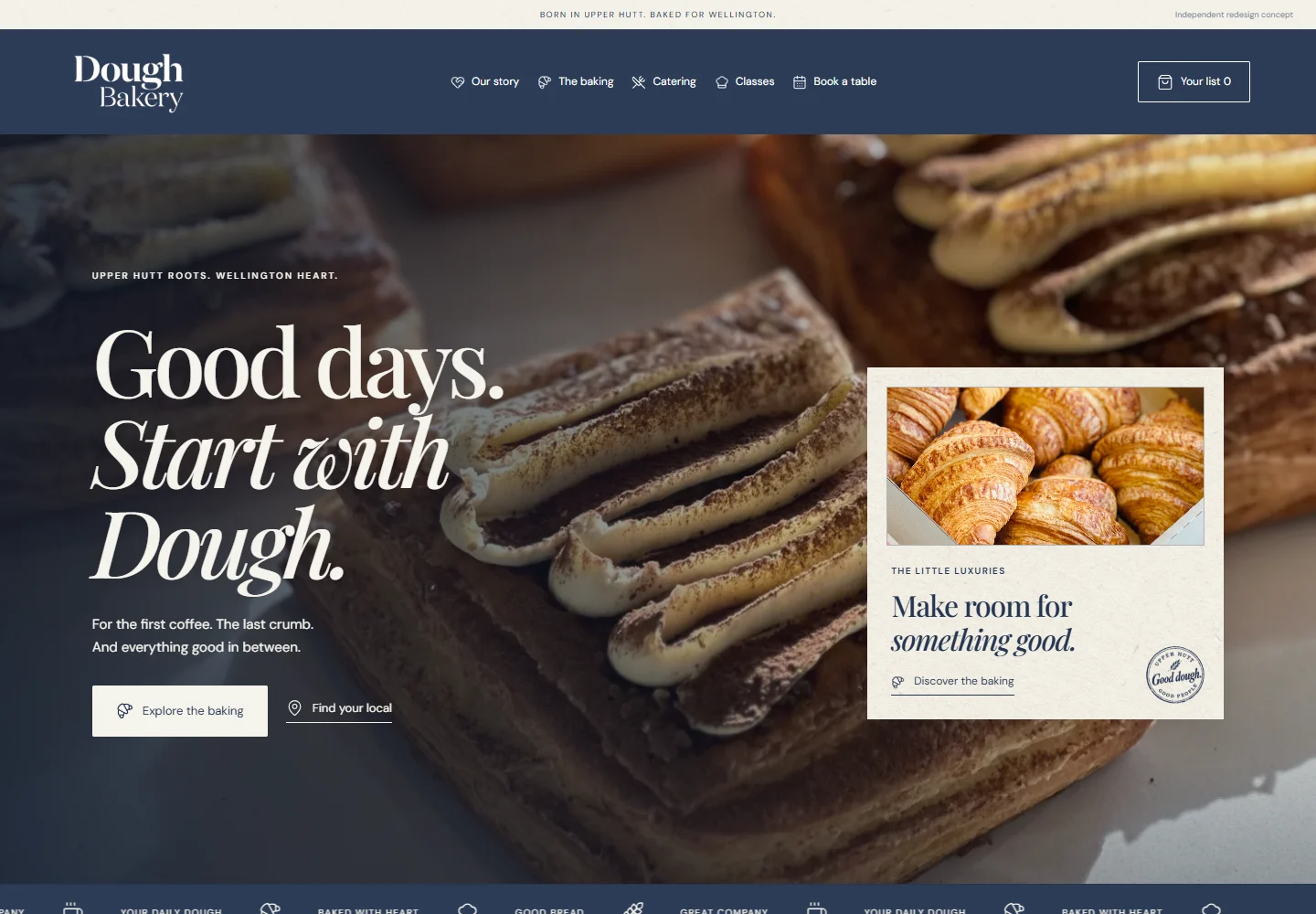
01 / THE OPPORTUNITY
Dough had real character to work with: a family story, beautiful baking, neighbourhood stores and hands-on classes. Its existing website already brought those things online. I saw an opportunity to make them feel more connected.
My starting point was simple: a brand’s digital presence should carry the same care as the experience people come back for. That means making an impression, building familiarity and helping someone take the next step.
A little local curiosity. A lot of attention to the details.
Bring the product, the voice and the next action into one clear opening.
Build a visual rhythm around its people, baking and personality.
Connect browsing with stores, catering, classes and product details.
02 / BEFORE & AFTER
Go on, move the slider.
 ORIGINALREDESIGN
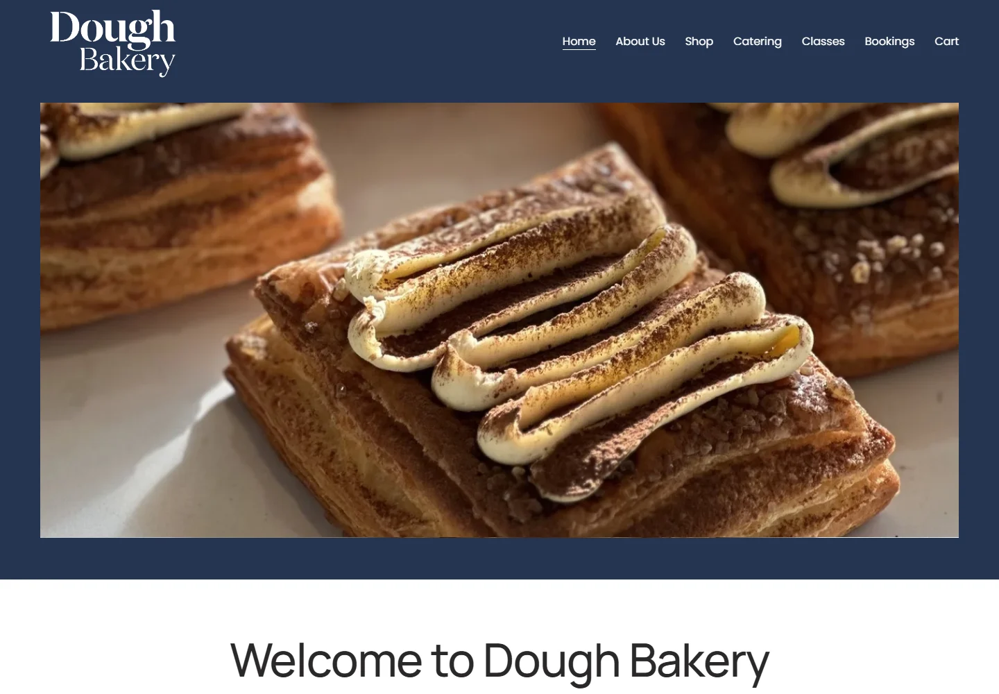
The original opens with a large product photograph. The redesign puts photography, a brand-led headline and routes to the baking and stores together in the first screen.
Actual browser captures · 1440 × 1000 px · 3 November 2026. The original homepage’s promotional overlay was dismissed for the comparison. Screenshots are presented at the same viewport size.
03 / ART DIRECTION

I kept the recognisable logo and navy palette, then built around them with paper, expressive type and photographs that feel close enough to touch.
Navy, warm cream and soft neutrals keep the identity grounded. Texture and contrast give the sections their own pace.
Editorial serif headlines meet straightforward body copy. Real product photos lead; frames and raster ink stamps add a tactile finish.
Gentle reveals, hover responses and a moving ribbon add energy. Reduced-motion preferences remain part of the experience.
I looked at Daily Bread and Belén locally, alongside GAIL’s, Tartine and Lune. The focus was visual hierarchy, photographic scale and paths into the offer. The outcome uses Dough’s own identity and content.
04 / THE EXPERIENCE
The direction carries beyond the homepage, into the moments that help someone choose, visit or learn more.
The family story gets its own editorial space, with genuine photographs and a path to the neighbourhood stores.
Categories, search, sorting and individual product pages make the range easier to explore. A saved list lets visitors keep favourites together.
FROM SCREEN TO STREET
An interactive map connects five listed stores with addresses, hours and directions. The digital journey has somewhere real to lead.
Try the location finder ↗05 / SMALL SCREEN, SAME CARE
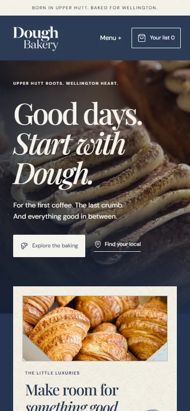
The mobile layout keeps the brand voice and gives the content a simpler vertical rhythm. Images stay proportional, navigation folds away and controls remain easy to reach.
The details still matter here.
06 / THE OUTCOME
A working multipage concept brings Dough’s identity, story and offer into one consistent experience. It’s a foundation for how the brand could show up online with more confidence.
This is an independent exploration, not commissioned client work. It has not been launched as Dough’s official website or tested with its customers. Conversion, sales and brand-perception gains remain hypotheses to validate.
Story, catalogue, products, catering, classes, locations and wholesale stay within the redesign. Purchases continue on Dough’s official store; the saved list is local to the visitor’s device. The booking page provides the café contact and its existing booking-service link.
My takeawayA website earns its place when the care in the design matches the care in the business.
Victor Moraes
Independent portfolio concept by Victor Moraes. Dough Bakery’s name, logo and original photographs belong to their respective owners. Website captures were taken on 3 November 2026; the original site may change. Brand and business information were drawn from Dough’s official About page and its public website. Paper and distressed stamp assets were generated for the concept. No customer research or measured commercial results are claimed.