MFIT PERSONAL
PRODUCT / BRAND / SYSTEMSA business tool
for personal trainers.
One platform for the business behind personal training.
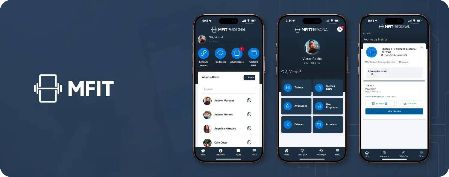 ONE PLATFORM. MORE POSSIBILITIES.Explore the project
01 / THE BRIEF
Why the product needed a rethink.
The situation
Personal trainers were moving between WhatsApp, spreadsheets and paper forms to run their businesses. Even the core task of prescribing a workout felt harder than the manual alternative.
The aim
Bring the work together, simplify the everyday actions, and give trainers an identity they could feel confident sharing with clients.
02 / WHAT I LEARNED
What I learned from the people using it.
Interviews with personal trainers, surveys, usage analytics and usability tests helped connect the day-to-day friction with a bigger question: how did trainers want to be seen? The seven-month Eikon study explored the gap between the existing brand and that ambition.
not guessingthe app, tested live
Make the core action easier
Workout prescription took too many screens and inputs. Trainers returned to familiar manual tools.
Build confidence in the brand
Research showed a gap between how trainers perceived MFIT and the professional image they wanted to project.
Help a business, not just a workout
The product needed to support client management, payments and business education alongside training.
THE EVOLUTION / MFIT PERSONAL
Before and after.
Drag the line to explore the earlier and redesigned identity and interface.
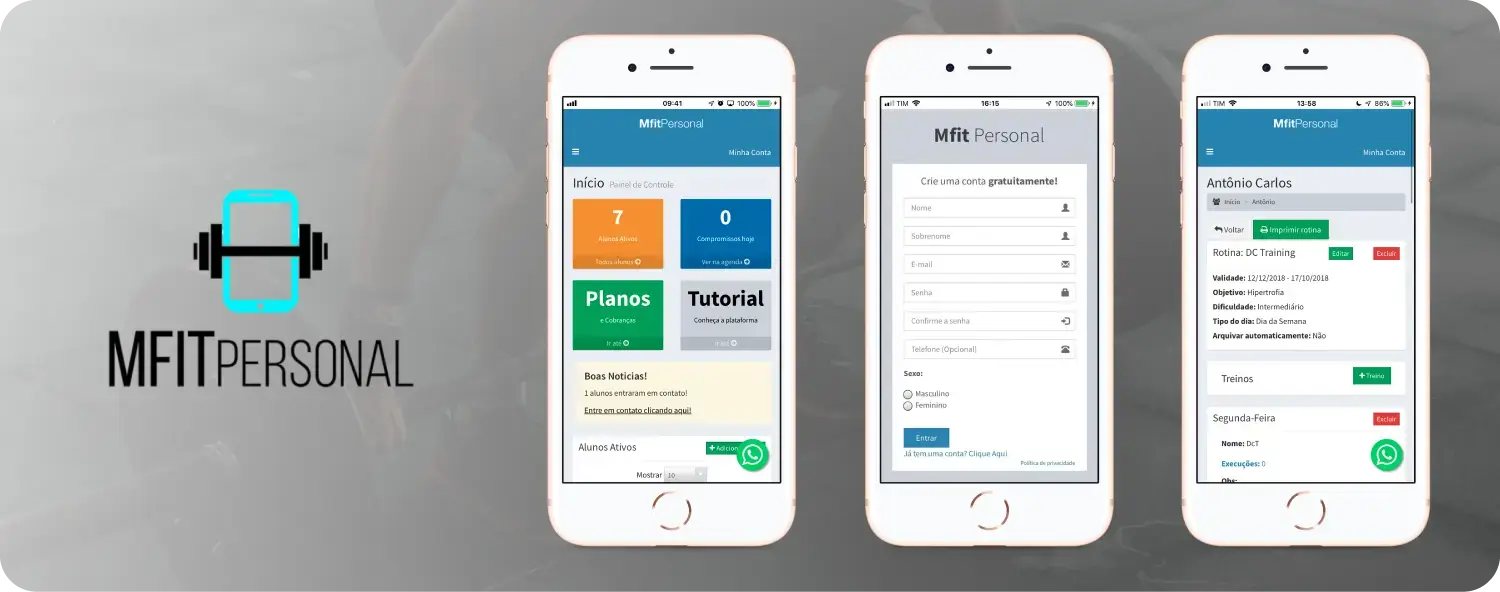
cyan headerone navy system,
app + brandBeforeAfter
Original images of the visual evolution; the screens show different tasks. Use the arrow keys to move the divider.
04 / DESIGN DECISIONS
The decisions behind the design.
A clearer prescription flow
Templates, reusable structures and fewer required fields helped simplify the most frequent task.
A shared design language
The Movement design system connected typography, colour, components and patterns across web and mobile.
A brand informed by research
The Eikon study guided the logo, visual language and tone toward the professionalism trainers wanted.
Support beyond the interface
Marketing para Personal added courses, e-books and templates to help trainers build their businesses.
05 / WHERE IT IS TODAY
The platform, today.
Platform scale as reported in the original case study. These describe MFIT’s reach, not a before-and-after of my work.
A PERSONAL TAKEAWAY
This project taught me to look beyond the screen in front of me. Some of the most useful insights came from informal conversations with trainers, and some of the strongest design decisions addressed their business rather than another interface.