

ESCAPE MATE
WEB REDESIGN / DESIGN PROPOSALThree worlds.
One clearer way in.
A design proposal for Wellington’s original escape rooms: a website that sells three missions as well as they play in real life.
01 / THE STARTING POINT
Great rooms.
A harder way to choose.
Escape Mate has been building life-sized, high-tech rooms by hand in Wellington since 2015. Each of its three rooms has a strong world of its own. This proposal asks how the website could carry that world, and help a group pick a room and book faster.
What I noticed
The three room pages run to roughly 2,100–2,900 words each, and the terms text is repeated on every one. The facts a group needs first, like players, price and difficulty, sit among the long text. Some details also drift between pages: difficulty is shown out of 10 on the room pages and out of 5 on the events page.
What I set out to do
Keep what already works, the rooms, the photography and the existing booking checkout, and give it a clearer structure. Make each room comparable at a glance, keep booking one tap away, and let the stories already on the site shape the design.
Figures taken from the public website on 4 November 2026. The size comparison covers the HTML document only, not images or scripts. They describe the starting point, not measured results.
02 / BEFORE & AFTER
The same rooms.
A clearer first look.
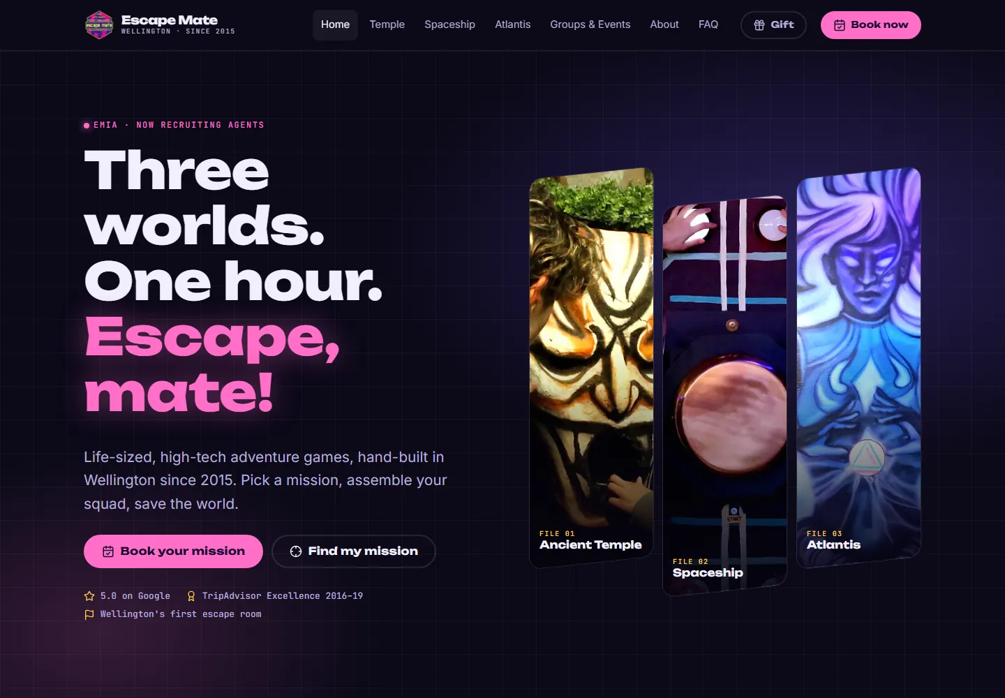
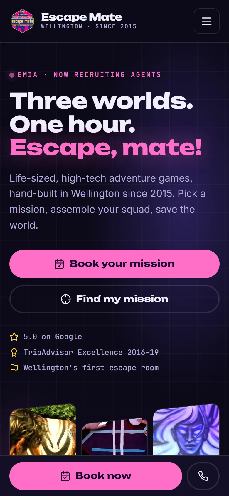
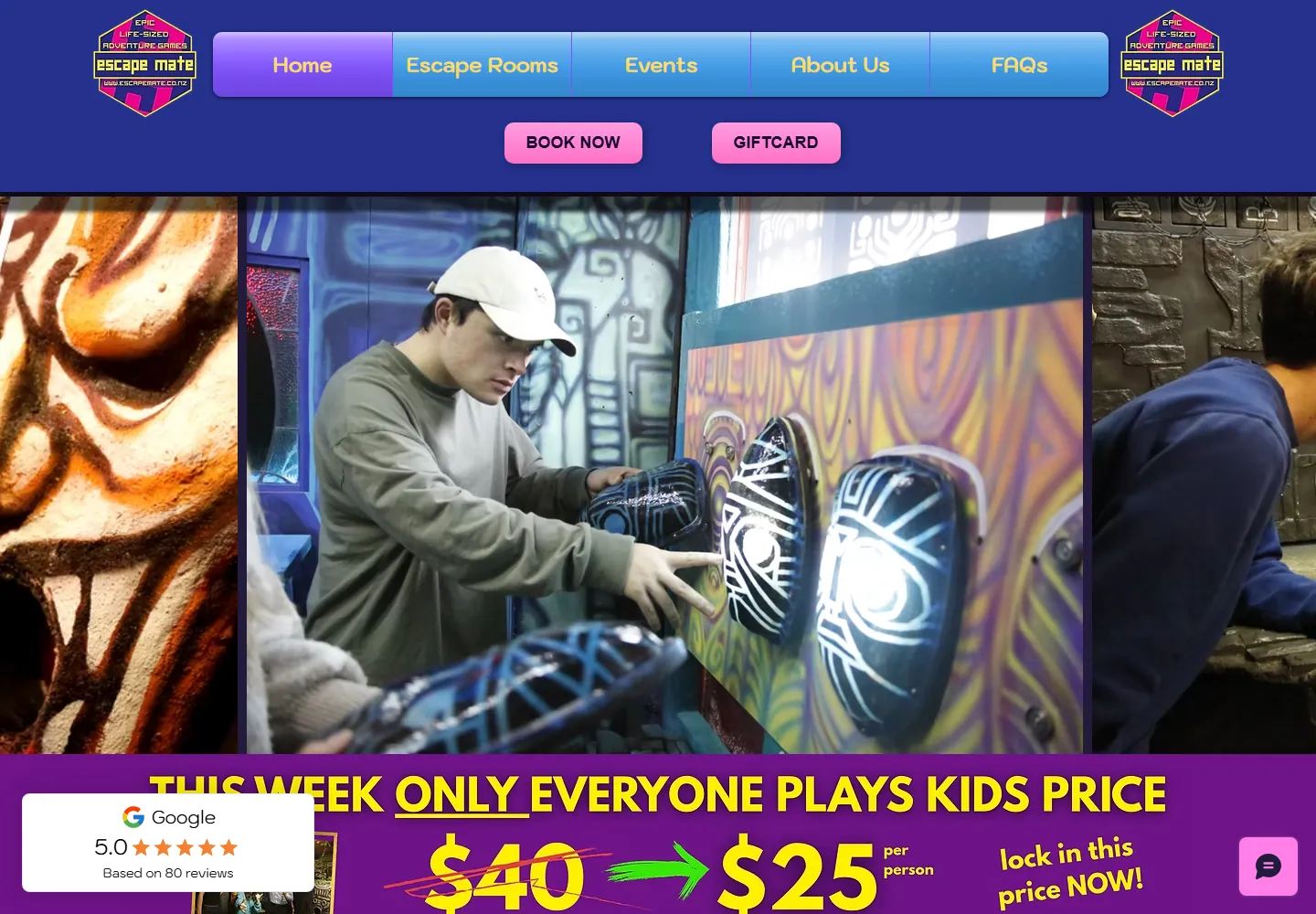
Drag the slider to compare the original website with the proposal, at the same viewport size.
 ORIGINAL
PROPOSAL
The original opens on a photo band and a promotional banner. The proposal puts the promise, the three rooms and a booking button into the first screen.
Actual browser captures · 1440 × 1000 px · 4 November 2026. The original’s promotional banner, review badge and chat widget appear as they did that day. Screenshots are shown at the same viewport size.
03 / THE CONCEPT
The site is
the agency terminal.
The rooms’ own stories already mention the Escape Mate Intelligence Agency. I made it the organising idea: a dark ops room in the logo’s pink and violet, mono-spaced dossier labels and a 60:00 countdown motif. Then each mission gets a skin of its own.
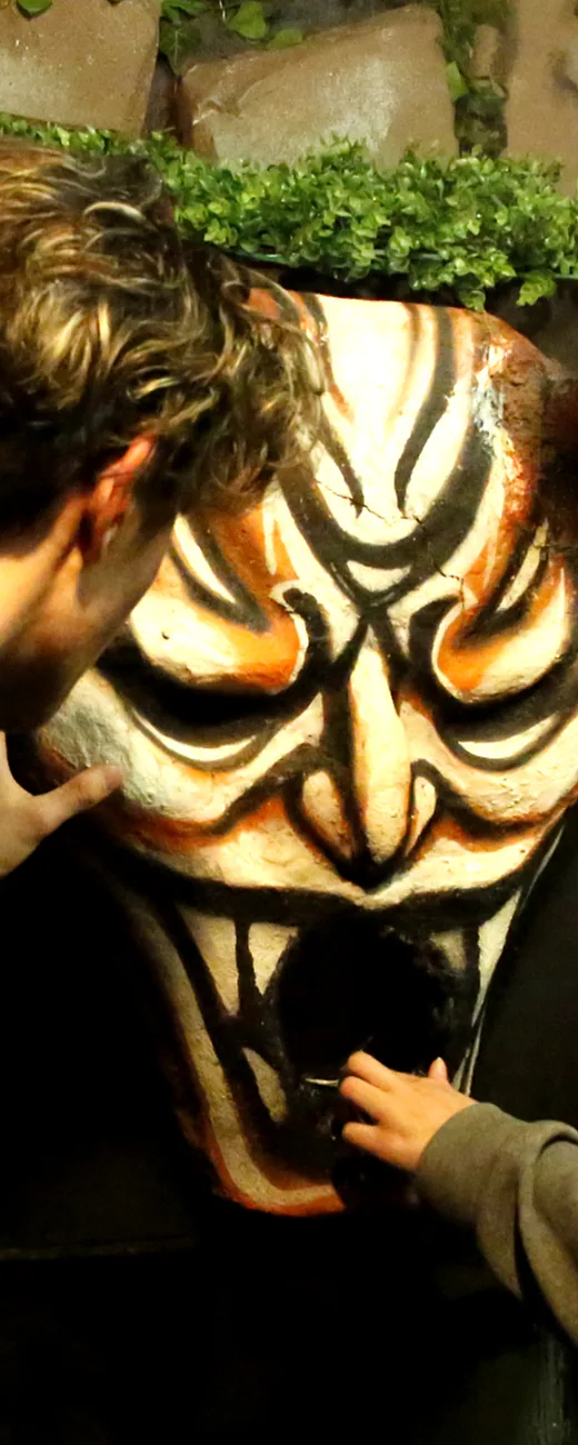
Cinzel type, a gold gradient, a flickering torch glow and Mayan-style glyph dividers.
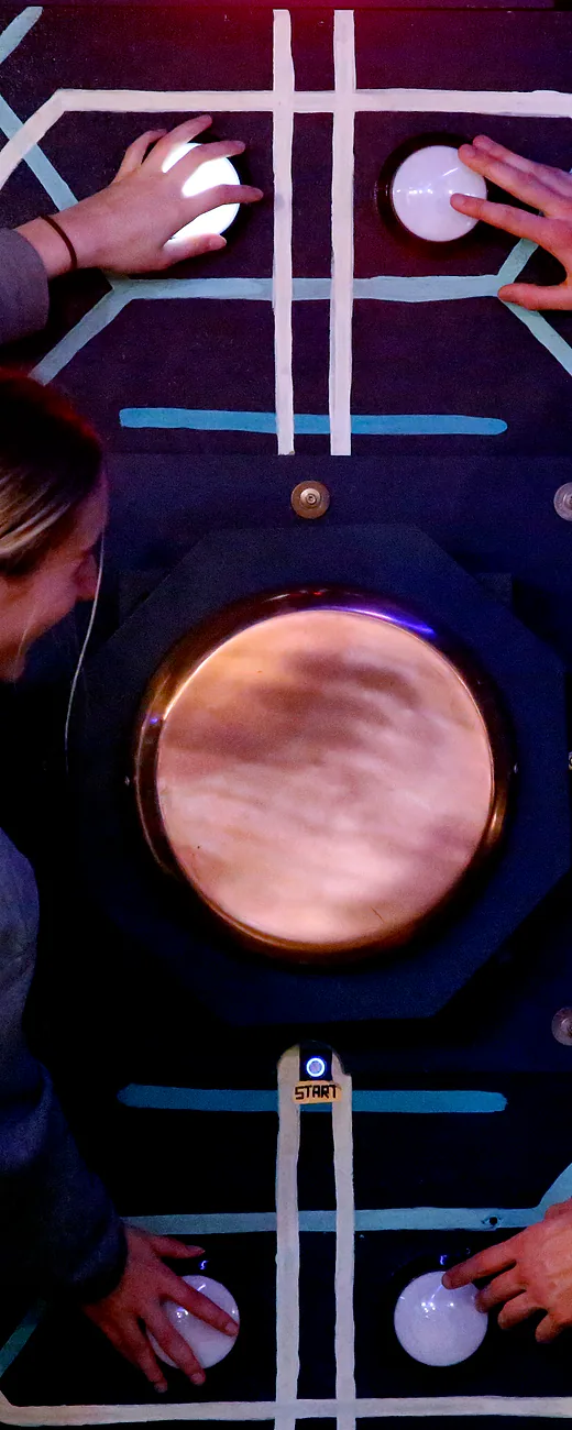
Chakra Petch type, alien-green scanlines, a live radar sweep and a distress-signal waveform.
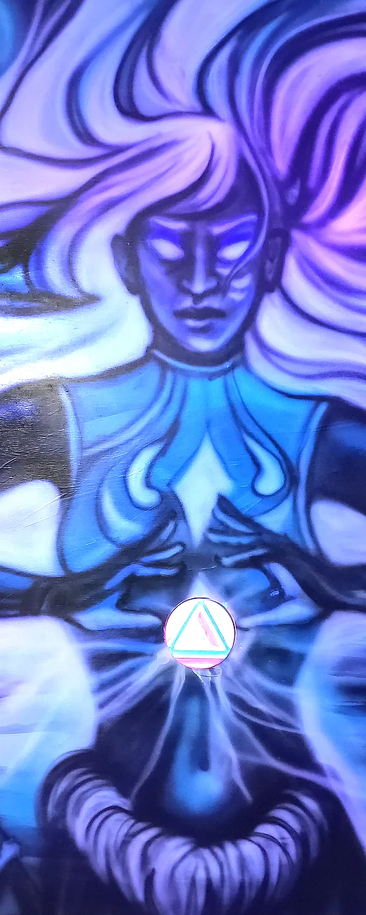
Cormorant type, a gradient that darkens as you scroll, a depth gauge and bioluminescent bubbles.
Redacted briefings
Each story hides its key lines behind redaction bars that a visitor reveals by hovering or tapping, so reading the lore becomes the first puzzle.
One system, three moods
Colour, type and motion change per room, while layout, spacing and controls stay the same. The rooms feel different and the site stays easy to learn.
The shared layer
Unbounded for headlines, Inter for reading and JetBrains Mono for the dossier labels. Deep ink surfaces carry the pink, violet and yellow of the logo.
04 / UX DECISIONS
Selling without
breaking the spell.
Each decision tried to make choosing and booking easier without flattening the fiction.
Mission Matcher
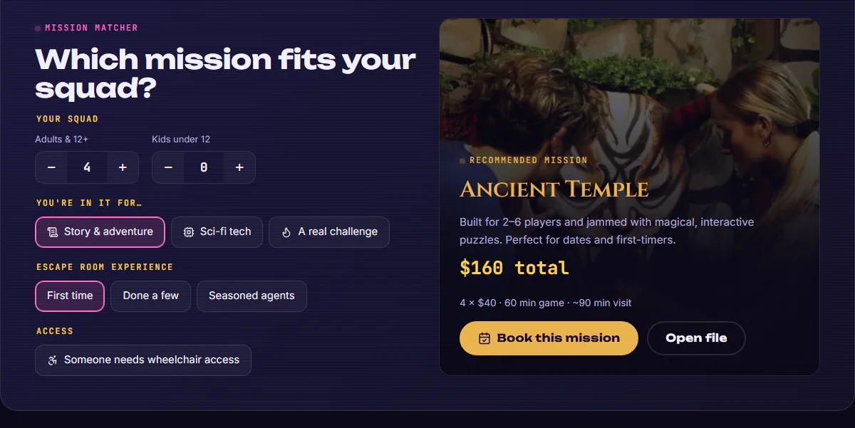
Squad size, kids, vibe, experience and accessibility produce a recommended room and a live price. The rules come from the FAQ.
Comparable dossiers
Every room shows players, difficulty out of 10, price and venue on the same scale, so a group can compare at a glance.
Booking one tap away
A persistent booking button in the header, and a bottom bar with a call button on mobile. Every button leads to Escape Mate’s existing checkout.
One source of truth
The terms live on one page with an at-a-glance summary. The FAQ is searchable, and corporate and party events share a page with tabs.
Light and accessible
Semantic HTML, visible focus, 44 px touch targets and reduced-motion support, built as static files with no framework.
05 / ACROSS SCREENS
The same story.
Sized for a thumb.
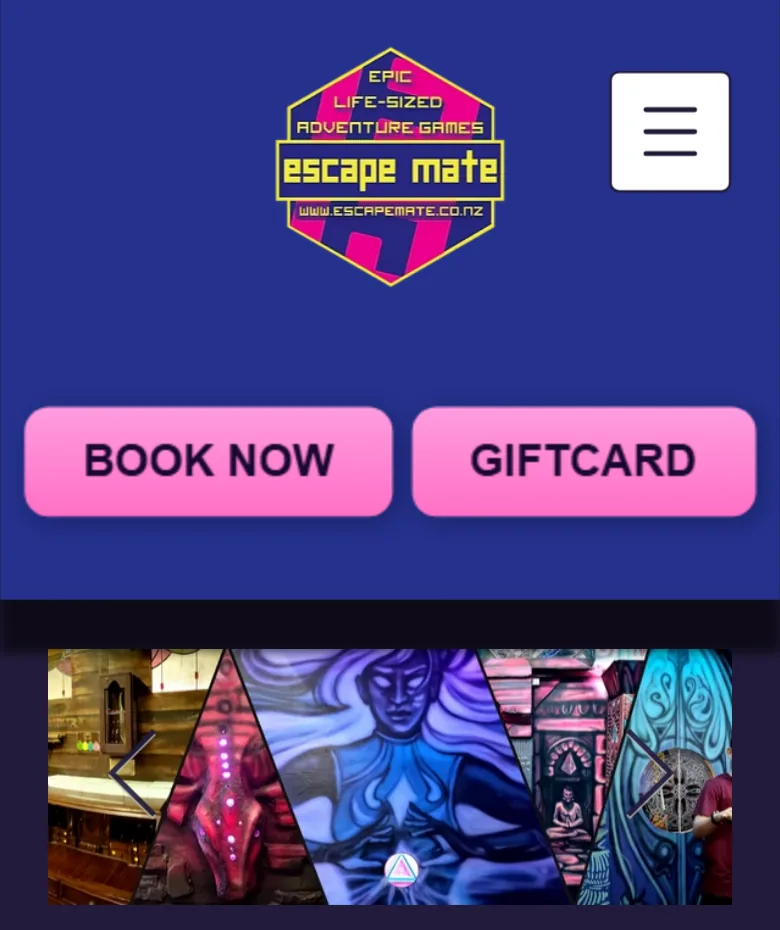
On a phone the header folds into a menu, a booking bar stays pinned to the bottom of the screen with a call button beside it, and the three rooms become a strip under the headline.
06 / STATUS & REFLECTION
A proposal,
built to be tested.
What exists today is the design and a working preview, made of static files.
- 8Pages in the working preview
- 3Room skins on one shared system
- 1Booking path: Escape Mate’s existing checkout
Escape Mate has not approved, adopted or tested this design. Bookings, conversion, real-world speed and visitor satisfaction have not been measured, and any improvement is a hypothesis to validate.
What I would validate next
- Can a first-time visitor pick a room quickly, without help?
- Does the Mission Matcher recommend the room people end up enjoying most?
- Do visitors find the terms and accessibility details they need?
- Does the pinned booking bar lead to more completed bookings on mobile?
Project notes & image credits
Self-initiated concept by Victor Moraes. Escape Mate’s name, logo, room photography and original copy belong to Escape Mate, and screenshots of its current website are shown here only for comparison.
Typefaces: Unbounded, Inter, JetBrains Mono, Cinzel, Chakra Petch and Cormorant (SIL Open Font License). Icons: Lucide (ISC).
“The rooms already told great stories. The website just had to let them.”
The most useful decision was treating the existing fiction as a design system, not as decoration. It gives the site a voice, and gives each room its own place inside it.
NEXT PROJECT
Dough Bakery ↗
Another independent website concept, for a Wellington bakery.